Showing posts with label CheckBox. Show all posts

Thursday, May 12, 2022

PowerApps: Checkbox Control

 Hello Friends,

Welcome back with another post on PowerApps. Today, we will discuss about Checkbox control. Let suppose, your project requirement is to add 2 checkboxes "A", "B". At a time only one checkbox can be selected (however, you may be thinking that this can be achieved using Radio control). Each checkbox has dependent multiple checkboxes. For "A", these are "A1", "A2", "A3". For "B", these are "B1", "B2".

Now, if "A" is selected, "A1", "A2", "A3" should be enabled and "B1", "B2" should get disabled as well as unchecked. Similar case if user selects "B". How do we implement this feature? Let's see-

  1. Navigate to PowerApps maker portal. Create a blank Canvas PowerApps "CheckBoxControlApp" and format as "Tablet".
  2. Now add two checkbox controls-
    1. CheckboxA
    2. CheckboxB
  3. Further add 3 checkboxes in Section A and 2 checkboxes in Section B.
  4. The basic structure is complete.
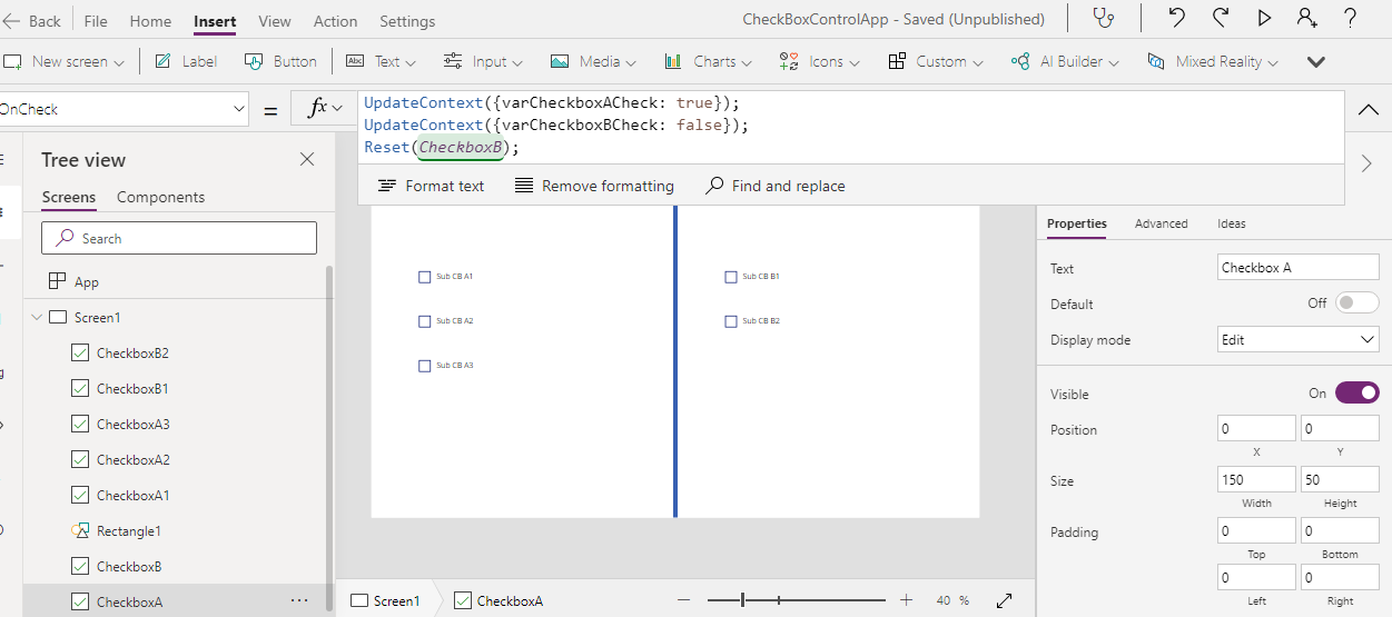
  5. Now, our first requirement is that the moment checkbox A or B is checked, the other one should get unchecked. For this, we will define 2 local variables-
    1. varCheckboxACheck
    2. varCheckboxBCheck
  6. We will set the similar one as true and the other one as false. Means, if clicked on A, varCheckboxACheck will be set as true and varCheckboxACheck will be set as false.
  7. We will set these variables upon "OnCheck" property.
  8. Now set the Default property on each checkboxes (A & B) with respective variables. for checkbox A, set Default property to varCheckboxACheck. Similarly for B.
  9. Now, save the app and play it. toggle between CheckboxA and CheckboxB. It's working. The moment, we click other checkbox, the previous get reset. In case, if there is an issue, please use Reset(CheckboxA) / Reset(CheckboxB) alongwith the existing code on OnCheck property.
  10. Now, the second part of requirement is to reset the dependent checkboxes and get them disabled as well.
  11. So, first, we will write logic for disabled. for this, click on any dependent checkbox (let's say ChechboxA1) and set the DislayMode property as below-
  12. Similarly, update the DisplayMode property for each dependent control. For dependent upon A checkbox, use varCheckBoxACheck while for B checkbox, use varCheckBoxBCheck.
  13. Now, the last part is to reset the dependent check boxes if the parent is unchecked. For this, you need to use the Reset function upon "OnCheck" property of each parent checkbox but with opposite dependent controls. Means, upon "OnCheck" of CheckBoxA, you need to Reset CheckBoxB1 & CheckBoxB2. Similarly, upon "Oncheck" of CheckBoxB, you need to Reset CheckBoxA1, CheckBoxA2 & CheckBoxA3.
  14. That's all. Save it, publish it and run it.
  15. Note: Homework for you. If user clicks on CheckboxA and then uncheck it, the dependent checkboxes status should restore to their original state.
With this, I am concluding this post.
Happy Coding !!!
Will see you again with some new topics.
Stay Safe !
Stay Healthy !

Friday, October 22, 2021

PowerApps: Approval Flow (Component)

 Hello Friends,

Welcome back with another post on PowerApps. Sometimes, we require to show the approval flow of any request in pictorial representation.

Here a request has 5 level of approvals. We are trying to show below information for each approver- 

  1. Photo
  2. Name
  3. Designation
  4. Approval Status
    1. Approved: Green
    2. Pending: Orange
    3. Rejected: Red
    4. Skipped: Gray
    5. Not Started: White

There are several ways to show the information. It depends upon the requirement of the client as well as other factors. I have show above the initial 2 ways. Another one, we will try to create. 🙂

Basically, we have created a component here in PowerApps. The benefit of making this as component is that, any change required in design will make reflected everywhere. Secondly, it is purely dynamic. You may have 2/3/4... level approval. It will manage accordingly.

So, let's start-

  1. Open the PowerApps Development Environment. Then click on-
    1. Apps link from left navigation. 
    2. Components libraries (preview) from right panel.
    3. + New component library (preview) on top menu strip.
  2. Basically, there are 2 ways to create a component in PowerApps-
    1. Inside a particular app. The drawback is that scope of such components is restricted to that app only. You cannot re-use that component in other apps.
    2. In component library. The benefit of such components are available for use in all apps.
  3. So, here, we are creating Component library.
  4. Now, give a suitable name to this component library-
  5. Click on Create. It will create a library with this name and add a default blank component named Component1 in this library. The benefit of Component library is that you can create multiple component in a single library. For example, as we have seen 2 ways to create Approval Flow component in the first screenshot and here we are creating the 3rd way. It means we have created 3 types of component for same feature. So, we can create all these 3 components in a single library and choose as per our requirement in PowerApps. 

  6. Rename this component as "ApprovalComponentRoundImage". Set height of component as 200.
  7. Add a custom property of input type so that we can ask the screen to provide the approvers list.
    1. Display Name: Approvers List
    2. Description: Please provide list of approvers.
    3. Property type: Input
    4. Data type: Table
  8. Click on Create.
  9. It will create a custom property. Now click on this property and you will find a sample table in the function box.
  10. Replace this table with below one. This is the sample of the table which we will pass from screen-
  11. Now, add a Blank horizontal gallery-
    1. Name: GalleryApprovers
    2. Height: Parent.Height
    3. Width: Parent.Width
    4. Items: ApprovalComponentRoundImage.ApproversList
    5. TemplatePadding: 0
    6. TemplateSize: 200 (Do not change right now, we will change it later)
  12. Now click on edit pencil icon of gallery template so that we can add control to it.
  13. So, now, we have the sample data and we have the gallery. It's time to add controls to display the data.
  14. To display the Photo, we will use 3 controls-
    1. Circle
    2. Icon
    3. Image
  15. To display the Approval Status, we will use 1 control-
    1. Icon
  16. To display the Name and Designation, we will use 1 control for each value-
    1. Label
  17. For User Photo: 
    1. Add a circle. You will find circle control in Shapes section from left navigation menu >> + Insert >> Shapes.
      1. Name: PhotoCircle
      2. Height: 100
      3. Width: PhotoCircle.Height
      4. X:(GalleryApprovers.TemplateWidth-PhotoCircle.Width)/2
      5. Y: 0
      6. Fill: RGBA(230, 230, 230, 1)
    2. Now, add Icon of type Person-
      1. Name: PhotoIcon
      2. Height: PhotoCircle.Height*0.6
      3. Width: PhotoIcon.Height
      4. X:PhotoCircle.X + (PhotoCircle.Width - PhotoIcon.Width) / 2
      5. Y: (PhotoCircle.Height-PhotoIcon.Height)/2
    3. Now add an Image control-
      1. Name: PhotoImage
      2. Height: PhotoIcon.Height
      3. Width: PhotoIcon.Width
      4. X: PhotoIcon.X
      5. Y: PhotoIcon.Y
      6. RadiusBottomLeft: PhotoIcon.Height/2
      7. RadiusBottomRight: PhotoImage.RadiusBottomLeft
      8. RadiusTopLeft: PhotoImage.RadiusBottomLeft
      9. RadiusTopRight: PhotoImage.RadiusBottomLeft
    4. For Approval Status:
    5. Add an Icon (for now select Check(badge))-
      1. Name: ApprovalStatusIcon
      2. Height: PhotoCircle.Height*.3
      3. Width: PhotoCircle.Width*.3
      4. X: PhotoCircle.X+PhotoCircle.Width-ApprovalStatusIcon.Width
      5. Y: PhotoCircle.Y+PhotoCircle.Height-ApprovalStatusIcon.Height
    6. For Approver Name:
    7. Add a Label-
      1. Name: DisplayNameLabel
      2. Size: 16
      3. FontWeight: Bold
      4. Align: Center
      5. AutoHeight: true
      6. DisplayMode: View
      7. PaddingTop: 1
      8. PaddingBottom: 1
      9. PaddingLeft: 5
      10. PaddingRight: 5
      11. Width: GalleryApprovers.TemplateWidth
      12. X: 0
      13. Y: PhotoCircle.Y+PhotoCircle.Height
    8. For Approver Designation:
    9. Add a Label-
      1. Name: DesignationLabel
      2. Size: 16
      3. FontWeight: Normal
      4. Italic: true
      5. Align: Center
      6. AutoHeight: true
      7. DisplayMode: View
      8. PaddingTop: 1
      9. PaddingBottom: 1
      10. PaddingLeft: 5
      11. PaddingRight: 5
      12. Width: GalleryApprovers.TemplateWidth
      13. X: 0
      14. Y: DisplayNameLabel.Y+DisplayNameLabel.Height
    10. Final look of template:
    11. The basic designing has been completed. Now, we need to bind data to these controls. But, there is a problem. The approval status can be one of the below possible values-
      1. Not Started (we will display WHITE filled circle)
      2. Pending (we will display ORANGE filled circle)
      3. Rejected (we will display RED filled circle with white ╳ in the middle)
      4. Approved (we will display GREEN filled circle with white ✓ in the middle)
      5. Skipped (we will display GRAY filled circle)
    12. There are 2 ways to do it-
      1. Mention colors as static
      2. Make input properties for these status and assign it accordingly.
    13. We will opt for 2nd option.
    14. Therefore, create custom property respective to each approval status.

    15. Selected Colors are-
      1. Approved: Green
      2. Pending: Orange
      3. Rejected: Red
      4. Skipped: LightGray
      5. NotStarted: White
    16. Now click on ApprovalStatusIcon and choose the Fill property and update the colors as below-
    17. Switch(
          ThisItem.ApprovalStatus,
          "Not Started",
          ApprovalComponentRoundImage.NotStartedColor,
          "Pending",
          ApprovalComponentRoundImage.PendingColor,
          "Approved",
          ApprovalComponentRoundImage.ApprovedColor,
          "Rejected",
          ApprovalComponentRoundImage.RejectedColor,
          "Skipped",
          ApprovalComponentRoundImage.SkippedColor
      )
      

    18. Update the Color property as (The reason is we have to display the icon type only if it is Approved/Rejected. For all other cases, we will display only filled circle)-
    19. Switch(
          ThisItem.ApprovalStatus,
          "Not Started",
          ApprovalComponentRoundImage.NotStartedColor,
          "Pending",
          ApprovalComponentRoundImage.PendingColor,
          "Approved",
          Color.White,
          "Rejected",
          Color.White,
          "Skipped",
          ApprovalComponentRoundImage.SkippedColor
      )
      
    20. Update the Icon property as-
    21. Switch(
          ThisItem.ApprovalStatus,
          "Not Started",
          Icon.Information,
          "Pending",
          Icon.Information,
          "Approved",
          Icon.CheckBadge,
          "Rejected",
          Icon.CancelBadge,
          "Skipped",
          Icon.Information
      )
      
    22. Update the Tooltip property and bind it with 
      1. ThisItem.ApprovalStatus
    23. With this, Approval Status icon has been completed.
    24. Now bind the Approver Name and Designation. For this, update the Text property of-
      1. "DisplayNameLabel" label as 
        1. ThisItem.UserName
      2. "DesignationLabel" label as 
        1. ThisItem.UserDesignation
    25. Now, the remaining part is image link. For this, you need to add connection of "Office 365 Users".
    26. Update the Image property of "PhotoImage" control as-
      1. Office365Users.UserPhotoV2(ThisItem.UserEmail)
    27. I think, We have covered all the points. Let's test it.
    28. In order to test the component we have created, PowerApps, provide a default screen in this Component library-
    29. Click on Screens. The click on Insert from tp navigation menu, then click on Custom. You will find the component you had created just now-
    30. Click on this component so that it get added on screen.
    31. You can seen in right side properties pane, all the default values of Custom Input Properties is getting reflected.
    32. Now, we will add more approvers in table. So, update the ApproversList property. Sample table is given below-
    33. Table(
          {
              SrNo: 1,
              UserName: "Sachin Jain",
              UserDesignation: "Module Leader",
              Icon: Icon.Person,
              ApprovalStatus: "Approved",
              UserEmail: "ml@companyname.com"
          },
          {
              SrNo: 2,
              UserName: "Lokesh Kumar",
              UserDesignation: "Project Leader",
              Icon: Icon.Person,
              ApprovalStatus: "Approved",
              UserEmail: "pl@companyname.com"
          },
          {
              SrNo: 3,
              UserName: "Nitin Paliwal",
              UserDesignation: "Senior Project Manager",
              Icon: Icon.Person,
              ApprovalStatus: "Skipped",
              UserEmail: "spm@companyname.com"
      }, { SrNo: 4, UserName: "Mayank Singh", UserDesignation: "Deputy General Manager", Icon: Icon.Person, ApprovalStatus: "Pending", UserEmail: "dgm@companyname.com"
      }, { SrNo: 5, UserName: "Finance Department", UserDesignation: "Finance Department", Icon: Icon.People, ApprovalStatus: "Not Started", UserEmail: "sample@companyname.com"
      } )
    34. Note: Here, I have added a sample email id for Finance Department UserEmail property because, Office365UserPhotoV2 will through error in case of blank value, hence, we have passed a dummy email id.
    35. Save it and run the app.
    36. As you can see, images of all approvers are getting appeared as well as the approval status color coding is also well managed. Have you noticed that the image of Finance department is not appearing, instead a person icon is showing. This is the reason, we have taken Icon control just below the Image control. In case, if image of any user is not available in system, then default person icon will be shown.
    37. With this, we can create an approval flow display.
    38. I had added a landscape screen and added the component upon it. SEcondly, I had changed the TemplateSize property of gallery "GalleryApprovers" to 200. As we have used all dimensions related to each other, therefore, it didn't hampered our design. The design managed the controls size and position itself.
    39. Now there are 2 more changes which we can add to it.
      1. Flow line (joining one approver to other)
      2. Look of approval status icon. As we can see, the square is not appealing good.
    40. First we will add flow lines.
    41. Add a rectangle and update below properties-
      1. Name: FlowLineLeftRectangle
      2. X: 0
      3. Y: PhotoCircle.Y+PhotoCircle.Height/2
      4. Width: PhotoCircle.X
      5. Height: 5
    42. Add another rectangle and update below properties-
      1. Name: FlowLineRightRectangle
      2. X: PhotoCircle.X+PhotoCircle.Width
      3. Y: PhotoCircle.Y+PhotoCircle.Height/2
      4. Width: GalleryApprovers.TemplateWidth-PhotoCircle.X-PhotoCircle.Width
      5. Height: 5
    43. The output will be-
    44.  
    45. Looking cool. But we don't want the left most and the right most line as these are starting and ending points.
    46. Change the Visible properties for above rectangles-
      1. FlowLineLeftRectangle-
        1. Visible: If(ThisItem.SrNo = First(ApprovalComponentRoundImage.ApproversList).SrNo,false,true)
      2. FlowLineRightRectangle-
        1. Visible: If(ThisItem.SrNo = Last(ApprovalComponentRoundImage.ApproversList).SrNo,false,true)
    47. Let's see the output-
    48. Wow.
    49. Now we will update the approval status icon feature.
    50. Add a circle control-
      1. Name: ApprovalStatusCircle
      2. X: ApprovalStatusIcon.X
      3. Y: ApprovalStatusIcon.Y
      4. Height: ApprovalStatusIcon.Height
      5. Width: ApprovalStatusIcon.Width
    51. Reorder the ApprovalStatusIcon and set it's order to "Bring to front".
    52. Now we will update the Fill property of ApprovalStatusCircle-
    53. Switch(
          ThisItem.ApprovalStatus,
          "Not Started",
          Color.White,
          "Pending",
          Color.Orange,
          "Approved",
          Color.Green,
          "Rejected",
          Color.Red,
          "Skipped",
          Color.LightGray
      )
      
    54. Now update below properties also for ApprovalStatusCircle-
      1. BorderColor: White
      2. BorderThickness: 1
    55. Now update the below properties of ApprovalStatusIcon-
      1. Fill: Transparent
      2. Visible: 
        1. Switch(
              ThisItem.ApprovalStatus,
              "Not Started",
              false,
              "Pending",
              false,
              "Approved",
              true,
              "Rejected",
              true,
              "Skipped",
              false
          )
          
    56. Now save the component and click on Screen tab and then play the App.
    57. In case, if you wish to show the approval status circle as full circle for Not Started status, you may add logic on BorderColor for ApprovalStatusCircle.
    58. This way, we can create approval flow component.
    59. There can be many more ways to design the component for the same functionality. This post is to give an idea for the same.
    With this, I am concluding this post.
    Happy Coding !!!
    Will see you again with some new topics.

    Stay Safe !
    Stay Healthy !

    Tuesday, October 5, 2021

    PowerApps: CheckBox (Extract Selected Items)

     Hello Friends,

    Welcome back with another post on PowerApps. Today, we will discuss about CheckBox control. Sometimes we have a situation where, we have to extract the selected checkbox values to show somewhere else. Means, the moment, we select a check box, it should get reflect in another gallery (where only selected values are getting shown). Upon Check/Uncheck of each item, this gallery should be updated. Let's see, how can we achieve this-

    1. Create a blank PowerApps. I am creating a tablet mode PowerApp.
    2. Now add a button and a vertical blank gallery.
    3. Choose the OnSelect property of button and define a collection which will be used as data source for the gallery. Name this collection as "collCheckBoxData". Now define another collection which will be used to hold the selected checkboxes values. Name it "collCheckBoxDataSelected". Also define two variables
      1. "varResetCheckBox" - This variable will be used to reset the check boxes checked status when we click on Load Data button.
      2. "varCheckedItems" - This variable will be used to hold the concatenated value of selected check boxes. (This is additional feature, we will discuss, where we will concatenate the values of selected check boxes  (delimiter based) so that we can save it in data source.
    4. The complete code is (you can map with color codes 😊)-
    5. ClearCollect(
          collCheckBoxData,
          {Title: "India"},
          {Title: "Russia"},
          {Title: "America"},
          {Title: "Japan"},
          {Title: "Brazil"},
          {Title: "China"},
          {Title: "South Korea"}
      );
      ClearCollect(
          collCheckBoxDataSelected,
          []
      );
      UpdateContext({varResetCheckBox: true});
      UpdateContext({varCheckedItems: ""});
      

    6. Now click on button using ALT key so that the function gets executed and the collection and variables could get initialized.
    7. Now edit the gallery we have added by clicking on edit icon as shown in below screenshot and add a checkbox.
    8. Set the template size to 60.
    9. Now we have to bind the data to this check box. For that, first we will bind collection with gallery.
    10. For this, click on gallery and set the Items property of gallery to "collCheckBoxData".
    11. Now again edit the template and click on Checkbox and set the Text property to ThisItem.Title.

    12. Now we have to apply some functions on OnCheck & OnUncheck property of checkbox.
    13. First, we will write function for OnCheck property. The objective is upon Checkbox checked event, we will check if this checkbox text is available in Selected Checkbox Data collection "collCheckBoxDataSelected". If not, then we will add it.
    14. Additionally, we will concatenate all selected text and will show in a label.
    15. Then we will set ResetCheckBox variable value to false. The complete code is-
    16. ForAll(
          Gallery2.AllItems,
          If(
              Checkbox2.Value = true,
              If(
                  CountA(
                      Filter(
                          collCheckBoxDataSelected,
                          Title = Checkbox2.Text
                      )
                  ) = 0,
                  Collect(
                      collCheckBoxDataSelected,
                      {Title: Checkbox2.Text}
                  );
              )
          )
      );
      UpdateContext({varCheckedItems: ""});
      UpdateContext(
          {
              varCheckedItems: Concat(
                  collCheckBoxDataSelected.Title,
                  Concatenate(
                      Title,
                      ";"
                  )
              )
          }
      );
      UpdateContext({varResetCheckBox: false});
      
    17. Similarly, we will write function for OnUncheck property. The objective is upon Checkbox checked event, we will remove unchecked box text from the Selected Checkbox Data collection "collCheckBoxDataSelected". 
    18. Additionally, we will concatenate all selected text and will show in a label.
    19. Then we will set ResetCheckBox variable value to false. The complete code is-
    20. ForAll(
          Gallery2.AllItems,
          If(
              Checkbox2.Value = false,
              RemoveIf(
                  collCheckBoxDataSelected,
                  Title = Checkbox2.Text
              )
          )
      );
      UpdateContext({varCheckedItems: ""});
      UpdateContext(
          {
              varCheckedItems: Concat(
                  collCheckBoxDataSelected.Title,
                  Concatenate(
                      Title,
                      ";"
                  )
              )
          }
      );
      UpdateContext({varResetCheckBox: false});
      
    21. Next we will update the Reset property of check box. Set this property with variable "varResetCheckBox".
    22. Major part has been done. Now we have to show the data of checkboxes, we have selected. For this we will add another vertical blank gallery.

    23. Set the data source as "collCheckBoxDataSelected"; Layout as "Title"; Fields as "Title". In case, if you don't find the fields to bind, just save and play the app and click on Load Data and then select any checkbox. It will load data in "collCheckBoxDataSelected". Now stop the app and assign the field.
    24. This way we have achieved the functionality.
    25. Now play the app

    26. Lastly, we have to display the concatenated value. For this, we will add a label and set it's Text property to the variable "varCheckedItems".

    27. The final screenshot 😊-
    28. Checkboxes selection-
    29. Checkboxes un-selection-
    30. Load Data (making all gallery and checkboxes in reset mode)-
    31. This way, you can implement such type of Checkbox functionality.
    With this, I am concluding this post.
    Happy Coding !!!
    Will see you again with some new topics.

    Stay Safe !
    Stay Healthy !