Hello Friends,
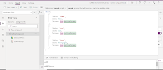
Welcome back with another post on PowerApps. Today, we will talk about Left Navigation Menu. First look at the below screenshot.

Here, the left navigation is shown in Collapse and Expand mode. We will try to create similar kind of navigation with only single level. There will be no nested menu. That we will discuss in another post. So, let's start-
- The process we will follow is-
- Create Left Navigation Menu as PowerApps Component using-
- A Hamburger Icon For Expand/Collapse
- A Gallery
- A Current Selected Indicator
- An Icon
- A Display Text Label
- Input Property :- MenuItems (Table type) to build menu links
- Input Property :- CurrentScreenTitle (Text type) to show current selected menu option
- Variable :- varOpenCloseMenu (true/false) to expand collapse Menu
- Start PowerApps maker portal. Then click on "Apps" from left navigation menu and the click on "Component libraries (preview)" from right section.

- Now click on "+ New component library (preview)" option showing at top navigation bar. It will ask to provide a name. Let's give "LeftNavigationComponent" and click on create. It will create a canvas component of 640x640 and the Components tab selected by default. The app also has Screens tab. This is provided to test the component.
- The basic difference between Canvas App and Component App is that Component App does not contain App component therefore it cannot be used as a full fledged App. We can create component in Canvas App also but that will be limited only to that app. Making component using Component library provides these components available to all apps.
- Now, our approach to make it dynamic as far as possible.
- Rename the component as "LeftNavComponent".

- Set the Height property to "Max(App.Height,App.DesignHeight)".
- Set the Width property to "Max(App.Width,App.DesignWidth)/5". I am setting width as 20% of the App width. We will change it later on to make it more dynamic for Expand/Collapse.
- Now save the component. It will ask you to provide the Component library Name. I have chosen "LeftNavComponentLibrary".

- Add an icon "Hamburger". Set -
- X-Position:- 0
- Y-Position:- 0
- Width:- 70
- Height:- 70
- Padding (Top/Bottom/Left/Right):- 5
- Rename:- IconHamburger

- Add Blank Vertical gallery and rename it "GalleryLeftMenu". Set -
- X-Position:- 0
- Y-Position:- IconHamburger.Y + IconHamburger.Height (Gallery will start from the ending position of IconHamburger)
- Width:- Parent.Width (Gallery width will be according to the Parent control width irrespective of Collapse/Expand)
- Height:- Parent.Height-GalleryLeftMenu.Y (Gallery height will be Parent control height - starting position of gallery)

- Add an input property to LeftNavComponent-
- Display Name:- Input Menu Table
- Name:- InputMenuTable (it will automatically filled based upon Display Name)
- Description:- Add description as per your wish
- Property Type:- Input
- Data Type:- Table
- Click on Create button to create the custom property.
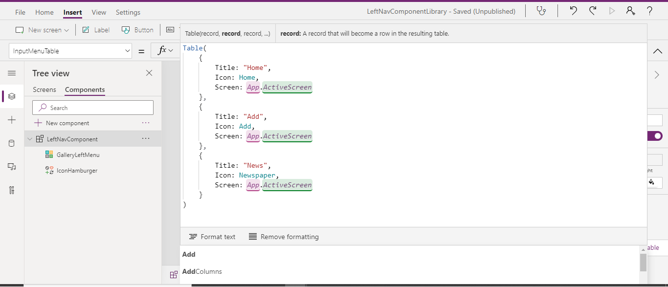
- Set the data for this property-
Table(
    {
        Title: "Home",
        Icon: Home,
        Screen: App.ActiveScreen
    },
    {
        Title: "Add",
        Icon: Add,
        Screen: App.ActiveScreen
    },
    {
        Title: "News",
        Icon: Newspaper,
        Screen: App.ActiveScreen
    }
)
- Come back to GalleryLeftMenu. Select it's Items property and set it to "LeftNavComponent.InputMenuTable".
- Now click on Edit Gallery icon to add controls.

- Add Icon >> Rectangle
- Set properties-
- X-Position:- 0
- Y-Position:- 5
- Width:- 10
- Height:- 70
- Rename:- RectangleCurrentSelected
- Add Icon >> Add
- Set properties-
- X-Position:- 10
- Y-Position:- 0
- Width:- 70
- Height:- 70
- Padding (Top/Bottom/Left/Right):- 5
- Rename:- IconMenu
- Icon:- ThisItem.Icon
- Add Label
- Set properties-
- X-Position:- 0
- Y-Position:- 0
- Width:- Parent.Width
- Height:- 70
- Padding (Top/Bottom/Right):- 5
- Padding Left:- 75
- Rename:- LabelDisplayText
- Text:- ThisItem.Title
- Come back to GalleryLeftMenu and select the property "TemplateSize". Set the value as 80.
- Now click on "LeftNavComponent" and create a new custom property-
- Display Name:- Current Menu Title
- Name:- CurrentMenuTitle
- Description:- It will store the title of current menu and will be used to make the current link Active.
- Property type:- Input
- Data type:- Text
- Click on Create to create the property.
- Now click on IconHamburger icon and select it's "OnSelect" property and set it's value as-
- Set(varOpenCloseMenu,!varOpenCloseMenu)
- It will be used to toggle the width of navigation menu.
- Now click on LeftNavComponent and create another custom property-
- Display Name:- Menu Width
- Name:- MenuWidth
- Description:- Current Width of Left Navigation Menu
- Property type:- Output
- Data type:- Number
- Click on Create to create the property.
- Now select this property from property dropdown and set it's function as -
- If(varOpenCloseMenu,Max(App.Width,App.DesignWidth)/5+40,70)

- Now click on GalleryLeftNavMenu and select it's width property. Set it's value to -
- LeftNavComponent.MenuWidth
- Do the same for "LeftNavComponent". Set it's width property to -
- LeftNavComponent.MenuWidth
- Now click on IconMenu and change it's properties as-
- X-Position:- 10
- Y-Position:- 5
- Width:- 60
- Height:- 70
- Padding (Top/Bottom/Left/Right):- 10

- Now click on "RectangleCurrentSelected" and set it's visible property to -
- ThisItem.Title = LeftNavComponent.CurrentMenuTitle

- Alternatively, you may also use below function to show/hide the active link rectangle-
- ThisItem.Screen = App.ActiveScreen
- If you using this function, then you don't need to define the input property "CurrentMenuTitle".
- This approach is more dynamic.
- That's all.
- Now, you want to test it. For this, click on Screens tab. You will find a default Screen1.
- Rename it HomeScreen. Now click on Insert menu and click on Button to add a button. Rename this button as ButtonHome. Change the text of button as "Button Home" Now choose the OnSelect property of this button. Add below function-
ClearCollect(
    colNavMenuTable,
    Table(
        {
            Title: "Home",
            Icon: Home,
            Screen: HomeScreen
        },
        {
            Title: "Add",
            Icon: Add,
            Screen: AddScreen
        },
        {
            Title: "News",
            Icon: Newspaper,
            Screen: NewsScreen
        }
    )
)
- Now click on Insert >> Custom. You will find the recently created component (LeftNavComponent) over there. Click on it to add it.
- Choose it's InputMenuTable property and set it to "colNavMenuTable", we have defined on above button click.
- Now choose it's CurrentMenuTitle property and set it to "Home", the title defined for Home icon.
- Make a copy of this screen twice and rename them as -
- AddScreen
- (Update CurrentMenuTitle as "Add")
- (Update button name as ButtonAdd and text as "Button Add")
- NewsScreen
- (Update CurrentMenuTitle as "News")
- (Update button name as ButtonNews and text as "Button News")
- Now play the app using Play link. Then click on ButtonHome to create the collection we have defined. As this is not an pure Canvas app therefore there is no App component where we can create the collection on OnStart. Therefore, we have used the button to achieve the purpose. The moment you click on button, collection will be created and the navigation will start reflecting. Now click on hamburger icon, Home icon, Add icon, News icon and see the performance.
- Button Home

- Button Add

- Button News

- This way we can achieve the navigation feature.
- Now, if you wish to use this component in your app -
- Create an app
- Add a screen
- Click on Get more components link provided at the bottom of page.
- A right side popup will display, choose the component you had build.
- Click on Import.
- It will be added in Library Components section in left side. Click on the component to add it to screen.


- Now, you may define your collection on App >> OnStart property (the same, we have done using button in Components apps screen)
- In my next post, we will discuss about nested navigation.
- Lastly, I would like to thanks "Matthew Devaney" and "Reza Dorrani' whose posts and videos became an inspiration for me to design this component. I have made changes as per my requirements and clubbed features of both post and video. You may also visit below URLs to go through their posts and videos-


With this, I am concluding this post.
Happy Coding !!!
Will see you again with some new topics.
Stay Safe !
Stay Healthy !
No comments:
Post a Comment
Note: Only a member of this blog may post a comment.