Thursday, September 30, 2021

PowerApps: Pen Input Control

 Hello Friends,

Welcome back with another post on PowerApps. As we have nowadays, lots of delivery person ask to sign on their mobile app during delivery of product. Have you ever thought that how it could get done and will it be possible in PowerApps?

Yes, it is possible in PowerApps and is quite simple. Let's see-

  1. For this, we will develop-
    1. PowerApps: Here, we will use PenInput control to allow user to draw his/her signature.
    2. Power Automate: This flow will be used to pick data from PowerApps and save in SharePoint library.
  2. Open the SharePoint site and click on App launcher icon (9 dots at top left corner). Here you will find the PowerApps site link. Click on it.
  3. It will open the PowerApps maker site. Here click on "+ Create" or "+ New App" and select Canvas app.
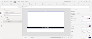
  4. Now click on Insert >> Input >> Pen input.


  5. Now add button and set display text as "Submit".
  6. Now whatever, we will draw on this Pen Input Canvas, we will save it in a variable. But before saving, we will extract the actual content of file because, the content itself in the form of base64 with prefix and suffix added to it. The same kind of extraction we have done in one of our earlier post.
    1. PowerApps: Upload File To SharePoint
  7. We will use below function for OnSelect property of button.
  8. UpdateContext(
        {
            vrPenInputData: JSON(
                PenInput1.Image,
                JSONFormat.IncludeBinaryData
            )
        }
    );
    UpdateContext(
        {
            vrBase64Value: Mid(
                vrPenInputData,
                Find(
                    ",",
                    vrPenInputData
                ) + 1,
                Len(
                    Mid(
                        vrPenInputData,
                        Find(
                            ",",
                            vrPenInputData
                        ) + 1
                    )
                ) - 1
            )
        }
    );
    

  9. Here we have partially completed the first part. The remaining part of the first part is to send this data to Power Automate to save in SharePoint Library.
  10. Therefore, first we have to create a Power Automate.
  11. For this, there are 2 options-
    1. Click on Action >> Power Automate >> + Create a new flow.
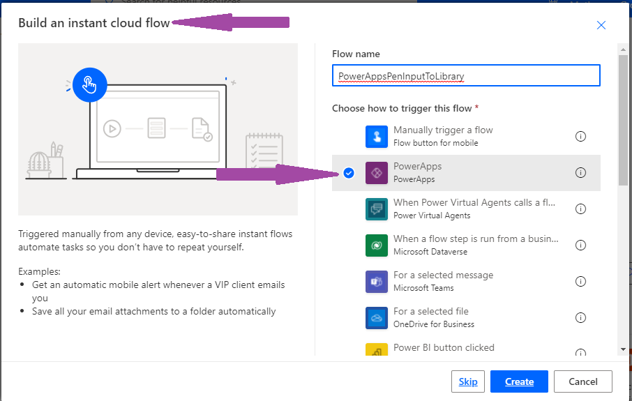
    2. Open the Power Automate site from the App Launcher >> Power Automate. Here you may click on + Create to create flow. Select the Instant Cloud Flow and then choose PowerApps.

  12. Now click on + New action and add an action names "Create file (SharePoint)".

  13. Select the Site address, folder name.
  14. Set File name as utcNow() with added extension of file as ".jpg".
  15. For file content, click on Ask In PowerApps from Dynamic Content window. It will create a dynamic variable that will be used to ask the file content from PowerApps.
  16. Save the flow. Now remove the file content variable from input box and click on Expression box. Use base64tobinary() function and pass this variable to this function and click on OK.
  17. Save the flow and come back to PowerApps.
  18. Now, first of copy the code of OnSelect property of button to a notepad. Then click on Action >> Power Automate. It will load all the PowerApps related flows. You will find the recently created flow here. Click on it to get added in OnSelect property.

  19. a
  20. The moment it will be added in OnSelect property, the rest code will get wiped. That's why, we have copied that code in notepad. Now copy the code from notepad and paste it back before the recently added PowerAutomate Code.
  21. Now, pass the variable vrBase64Value to this flow.

  22. That's all. Now save the PowerApps and play it.


  23. This way, we can achieve this functionality.
With this, I am concluding this post.
Happy Coding !!!
Will see you again with some new topics.

Stay Safe !
Stay Healthy !

Monday, September 27, 2021

PowerApps: Context Variable With Navigate Function

 Hello Friends,

Welcome back with another post on PowerApps. We all know that we can define two types of variables in PowerApps-

  1. Global Variable:- These types of variables are defined using Set function. Scope of these types of variables is entire App.
    1. Set(varGlobal001, "Global Variable 1")
      
  2. Context Variable:-  These types of variables are defined using UpdateContext function. Scope of these types of variables is the same screen. These variables are not available on other screens in that App.
    1. UpdateContext({varContextVariable:"Context Variable 1"})
      
But, if I say that you can access Context Variables on other screen to which you are navigating, then you will be surprised.
Yes, we can access the Context Variables on other screens as well. But there is a condition. Let me explain. We have Navigate function which is used to navigate from one screen to other. Everyone provides 2 values to this function-
  1. ScreenName (to which user has to be navigated)
  2. ScreenTransitionType (transition type of screen during navigation. i.e. None, Fade, Cover...)
Now, rare of you knows that the Navigate function has one more parameter called context. It is optional type parameter. You can pass a record that contains the name of at least one column and a value for each column. This record updates the context variables of the new screen as if passed to the UpdateContext function.
Let's understand with an example.
  1. Create a PowerApp. By default Screen1 will be added automatically. Now add one more blank screen "Screen2".
  2. Navigate to Screen1 and add 2 labels, 2 input text boxes and 1 button.
  3. Now add below Navigate function on Button >> OnSelect property.
  4. Navigate(Screen2,ScreenTransition.Fade,{varText1:TextInput2.Text,varText2:TextInput3.Text})
    

  5. Remember, till now, we haven't perform any activity on Screen2.
  6. Now, click on Screen2 and add 2 labels. Now change the Text property on these labels. The moment you start writing vart, it will populate both variables, we have defined on previous screen in Navigate function.
  7. Assign varText1 variable to first label and varText2 variable to second variable.
  8. You may add one button to navigate back to Screen1.
  9. Now save the app and play. Below are 2 screenshots. The first one is on Screen1 where I input "Hello" and "World" as input text to first and second textbox respectively.
  10. Now clicked on Navigate button. Second screen appears where first label is showing the value of first variable while second label is showing value of second variable.
  11. You may play with this by going back, changing the text box values and navigating again to Screen2.

  12. This way you can use Context Variables to pass information from one screen to other screen. Using this feature, you can remove dependency upon Global Variables, thus resulting the App performance.
With this, I am concluding this post.
Happy Coding !!!
Will see you again with some new topics.

Stay Safe !
Stay Healthy !

Sunday, September 26, 2021

PowerApps: Nested Gallery - Alternate Row Color

Hello Friends,


Welcome back with another post on PowerApps. In our last post, we have studied on how to create nested Gallery and then we have applied the Expand / Collapse feature on that gallery. Then we applied Expand All / Collapse All.

  1. PowerApps: Nested Gallery
  2. PowerApps: Nested Gallery - Expand / Collapse
  3. PowerApps: Nested Gallery - Expand All / Collapse All
Now, we will try to add Alternate Row Color in nested gallery (Items gallery). For this, we will add a dynamic column RowNumber and assign a sequential value to it. Then we will use this RowNumber to define the color of rows. But Before start, I assume that you had visited all the three posts above and created the PowerApps as described. Let's start for further implementation.

  1. Click on GalleryItemDetails gallery and select the Items property. Right now it is mentioned as ThisItem.ListItemDetails.
  2. Now, change the function with below-
  3. With(
        {RecordsListItemDetails: ThisItem.ListItemDetails},
        ForAll(
            Sequence(CountRows(ThisItem.ListItemDetails)),
            Patch(
                Last(
                    FirstN(
                        RecordsListItemDetails,
                        Value
                    )
                ),
                {RowNumber: Value}
            )
        )
    )
    
  4. Further, select the TemplateFill property of the same gallery (GalleryItemDetails) and add below function. It will check if Mod value is ZERO (means even number row) then it will apply one color otherwise (odd number row) other color.
  5. If(Mod(ThisItem.RowNumber,2)=0,RGBA(241, 244, 209, 1),RGBA(200, 200, 200, 1))
    
  6. Save the PowerApps and execute/play. The magic works. 🙂

  7. This way, we can add Alternate Row Color in PowerApps Gallery.
With this, I am concluding this post.
Happy Coding !!!
Will see you again with some new topics.

Stay Safe !
Stay Healthy !

PowerApps: Nested Gallery - Expand All / Collapse All

Hello Friends,

Welcome back with another post on PowerApps. In our last post, we have studied on how to create nested Gallery and then we have applied the Expand / Collapse feature on that gallery.

  1. PowerApps: Nested Gallery
  2. PowerApps: Nested Gallery - Expand / Collapse

If you have not read these posts, please go through it.

Now, we will try to implement Expand All / Collapse All feature. Let's start-

  1. I am assuming that you have read my last 2 posts mentioned above and created the PowerApps as described. We will continue from there.
  2. Let's add 2 buttons-
  3. Button1:
    1. Name: btnCollapseAll
    2. Text: Collapse All
    3. OnSelect: ClearCollect(SelectedOrderIDCollection,{SelectedOrderID:0})
  4. Button2:
    1. Name: btnExpandAll
    2. Text: Expand All
    3. OnSelect: 
    4. ClearCollect(
          SelectedOrderIDCollection,
          {SelectedOrderID: 0}
      );
      ForAll(
          OrdersList,
          If(
              CountRows(
                  Filter(
                      SelectedOrderIDCollection,
                      SelectedOrderID = OrdersList[@OrderID]
                  )
              ) = 0,
              Collect(
                  SelectedOrderIDCollection,
                  {SelectedOrderID: OrdersList[@OrderID]}
              )
          )
      );
      
  5. For Collapse All, we have cleared the collection which was storing the OrderID. As the collection becomes clear, no Order is there therefore, all galleries height will become ZERO (0).
  6. For Expand All, first we have cleared the collection, then, we have added all OrderIDs in that collection. Therefore, all galleries will be now having height based on their items count.
  7. That's all. It was so simple to implement.
  8. This way you can apply Expand All & Collapse All feature in nested gallery.
With this, I am concluding this post.
Happy Coding !!!
Will see you again with some new topics.

Stay Safe !
Stay Healthy !

Friday, September 24, 2021

PowerApps: Nested Gallery - Expand / Collapse

 Hello Friends,

Welcome back with another post on PowerApps. In our last post, we have studied on how to create nested Gallery. We have successfully achieved the functionality. Now, by default, all nested galleries were appearing in expanded mode. We want to show only the selected order item gallery in expanded mode and other in collapse mode. Let's see-

If you have not read my previous post on Nested Gallery, please visit below link to go through and create the Nested Gallery PowerApps.

  1. PowerApps: Nested Gallery

Now, as we to make changes so that only the selected Order's detail would get expanded and remaining gets collapsed. For this, 

  1. Option 1: Only One Expanded At A Time
  2. We will make a little change in the height property of nested gallery. Set the Height property of GalleryItemDetails as
  3. If(ThisItem.OrderID = GalleryOrderMaster.Selected.OrderID,(CountA(ThisItem.ListItemDetails.ItemName)+1)*50,0)
    
  4. This way, when we click on any Order ID, it's nested gallery will get a height of 50 times the number of rows +1. For rest of the order ids, their nested gallery will have the height as 0.

  5. Now save the PowerApps and execute (play). The output will be
  6. This way, only one order will be displayed in expanded mode at a time.
  7. Option 2: Multiple Expanded At A Time
  8. Sometimes there could be scenario that user need to expand more than one order at a time. Click on order id should be in a toggle mode. If Collapsed then it should expand otherwise collapse.
  9. For this, we will use another local collection, where we will store the OrderID, upon which the user has clicked. Upon first click, the ID will get saved in this collection.
  10. Upon second click, it will be removed from the collection.
  11. This would be a repetitive process.
  12. For this, we will add a collection creation code on btnLoadData. You may write the same on App >> OnStart.
  13. ClearCollect(SelectedOrderIDCollection,{SelectedOrderID:0});
    
  14. It will create a local collection with name as "SelectedOrderIDCollection" and having one record with column name as SelectedOrderID and value as 0. Being 0 will not be ID for any order hence, it will not impact our logic.
  15. Now add below logic on GalleryOrderMaster >> OnSelect property-
  16. If(
        CountRows(
            Filter(
                SelectedOrderIDCollection,
                SelectedOrderID = GalleryOrderMaster.Selected.OrderID
            )
        ) = 0,
        Collect(
            SelectedOrderIDCollection,
            {SelectedOrderID: GalleryOrderMaster.Selected.OrderID}
        ),
        Remove(
            SelectedOrderIDCollection,
            Filter(
                SelectedOrderIDCollection,
                SelectedOrderID = GalleryOrderMaster.Selected.OrderID
            )
        )
    )
    
  17. This function will check if the selected OrderID is present in local selected collection (SelectedOrderIDCollection). If not, then this function will add it, otherwise it will remove. Means a toggle functionality will work.
  18. Now, we redefine the Height property of GalleryItemsDetails. Change the existing function to-
  19. (CountA(ThisItem.ListItemDetails.ItemName) + 1) * 50 * CountA(
        Filter(
            SelectedOrderIDCollection,
            SelectedOrderID = ThisItem.OrderID
        )
    )
    

  20. Now save the PowerApps and execute/play the same.


  21. This way, we can achieve the multiple expand feature in PowerApps nested gallery.
  22. In our next post, we will learn about Expand All / Collapse All.
With this, I am concluding this post.
Happy Coding !!!
Will see you again with some new topics.

Stay Safe !
Stay Healthy !

PowerApps: Nested Gallery

Hello Friends,

Welcome back with another post on PowerApps. We are starting a series of posts in which we will learn about-

  1. Nested Gallery
  2. Expand / Collapse (individual master child record set)
  3. Expand All / Collapse All
  4. Alternate row color
Below is the overview of functionality, we are going to discuss-

We will learn all these features one by one. So let's start-

  1. Before starting, we need a SharePoint List having below columns-
    1. OrderID
    2. ItemName
    3. ItemQuantity
  2. We have kept the list simple to just show the functionality.
  3. Now add 5-6 orders with each having multiple items.

  4. Now click on App Launcher (grid of 9 dots at top left corner) and click on PowerApps to open the PowerApps maker platform.
  5. I am creating PowerApps in Tablet mode so that the display of nested gallery should be clear.
  6. First of all, add connection with SharePoint list. For this, click on Data icon from left navigation menu, click on Add Data. Now select the SharePoint connector. Select the Site and then list "OrdersList".
  7.  
  8. Now, add a button at bottom right corner which will load the data from SharePoint to local collection.
  9. Click on Insert >> Button. Rename it btnLoadData. Set Text as "Load Data".
  10. Add below function on "OnSelect" property-
  11. ClearCollect(OrdersListCollection,GroupBy(OrdersList,"OrderID","ListItemDetails"));
    
  12. This function will load the data from SharePoint list into a local collection "OrdersListCollection" with grouping on OrderID. The grouped data will reflect under column "ListItemDetails". It means, the local collection will have two column-
    1. OrderID
    2. ListItemDetails


  13. Now we will add gallery control on screen. For this, choose the gallery of type "Blank flexible height". The reason behind this is that we will expand the item based on the number of child items.

  14. Set the-
    1. Height property of gallery as "Parent.Height"
    2. Width property as "1000"
    3. Items property as "OrdersListCollection"
  15. Now click on the Edit icon of item template as shown in below screenshot-
  16. Add a label and set it's-
    1. Width as 400
    2. Position X as 0
    3. Position Y as 0
    4. FontWeight as Bold
    5. Height as 50
    6. Fill as RGBA(241, 244, 249, 1)
    7. Rename it as lblOrderID
    8. Text as Concatenate("Order ID: ",Text(ThisItem.OrderID))
  17. Add one more label and set it's-
    1. Width as 585
    2. Position X as 400
    3. Position Y as 0
    4. FontWeight as Bold
    5. Height as 50
    6. Fill as RGBA(241, 244, 249, 1)
    7. Rename it as lblCustomer
    8. Text as Concatenate("Customer: ",LookUp(OrdersList,OrderID = ThisItem.OrderID,'Created By'.DisplayName))

  18. This will show the Order ID and the Customer name. Rename this gallery as "GalleryOrderMaster".
  19.  Now we will add one more gallery, which will show the Items associated with that particular Order ID. Once again, click on edit icon as shown in Step 20 and add another gallery of type "Blank flexible height". Rename it as "GalleryItemsDetails".
  20. Set-
    1. Position X as 50
    2. Position Y as 50 (you may set it dynamic by specifying lblOrderID.Height + lblOrderID.Y)
    3. Width as 885
    4. Height as 100 (we will make it dynamic later in code)
    5. Items as ThisItem.ListItemDetails
  21. Now we will add two labels to show the ItemName and ItemQuantity.
  22. Add first label and set-
    1. Name as lblItemName
    2. Text as ThisItem.ItemName
    3. Position X as 0
    4. Position Y as 0
    5. Width as 300
    6. Height as 50

  23. a
  24. Similarly, add another label and set-
    1. Name as lblItemQuantity
    2. Text as ThisItem.ItemQuantity
    3. Position X as 300
    4. Position Y as 0
    5. Width as 300
    6. Height as 50

  25. This way you can show nested items. The basic part is complete. Now, if you execute the PowerApps, you will find that the height of nested gallery is fixed. So, we will make it dynamic. For this, set the Height of GalleryItemDetails as "(CountA(ThisItem.ListItemDetails.ItemName)+1)*50". We have added +1 to make sure there should be no scrollbar.

  26. This way we can achieve nested gallery functionality. In next post, we will discuss about Expand / collapse feature in nested gallery.
  27. UPDATE:
    1. Some times, you may find that if the data in nested gallery is too large, then the behavior of parent-nested gallery becomes abnormal.

    2. As you can see, Parent Items (Kamal, Manoj...) are inline with Child Items (Item-491, Item-492...). (Below is the dynamic height code which you will read in my next articles of this series).
    3. The Height code is-
    4. If(
          ThisItem.OrderID = ParentGallery.Selected.OrderID,
          (CountA(
              Filter(
                  CollChild,
                  OrderID = ThisItem.OrderID
              ).ItemName
          ) + 1) * 50,
          0
      )
      
    5. To avoid this situation, we need to fix the height of child gallery upto a max limit. But the problem is that, there is Max Height property available for Gallery control.
    6. So, we have prepared a workaround to overcome this problem. We have Min function. We will make use of it.
    7.  Let's modify the code for Height (I am taking maximum height for child gallery as 400)-
    8. If(
          ThisItem.OrderID = ParentGallery.Selected.OrderID,
          Min(
              (CountA(
                  Filter(
                      CollChild,
                      OrderID = ThisItem.OrderID
                  ).ItemName
              ) + 1) * 50,
              400
          ),
          0
      )
      
    9. After implementing this code, the height of child gallery is set to maximum 400 as the calculated height was much greater than 400. Therefore, Min function gave 400 as output.
    10.   
    11. In case if the calculated height is less than 400, in that case, the Min function will gave the calculated value as output. 
With this, I am concluding this post.
Happy Coding !!!
Will see you again with some new topics.

Stay Safe !
Stay Healthy !

Tuesday, September 21, 2021

PowerApps: Add/Merge/Join Two Collections With Sequence Number

Hello Friends,

Welcome back with another post on PowerApps. Sometimes, we have requirement where we have data in 2 or more collections. Now, we have to club all these collections and get only single collection so that the same can be displayed in grid or can perform any further action. This can be done simply using ClearCollect-

  1. ClearCollect(MergedCollection, Collection1,Collection2);
The issue arises when we have to maintain a sequence number with the collection items. Well, this can also be done in a very simple manner. 🙂

  1. Let's we have a SharePoint list having records.
  2. The same is fetched in PowerApps.
  3. ClearCollect(
        DataFromExcelSelectedColumns,
        ShowColumns(
            DataFromExcel,
            "FirstName",
            "LastName",
            "FullName"
        )
    );
    
  4. We have fetched only 3 columns (FirstName, LastName, FullName) and store the data in collection named "DataFromExcelSelectedColumns".
  5. Now we will add a column named "RowNumber" which will assign the items a sequential number. The new item collection is stored in a new collection named "DataFromExcelSelectedColumnsSequence". This collection will be used for merging.
  6. ForAll(
        DataFromExcelSelectedColumns,
        Collect(
            DataFromExcelSelectedColumnsSequence,
            Last(
                FirstN(
                    AddColumns(
                        DataFromExcelSelectedColumns,
                        "RowNumber",
                        CountRows(DataFromExcelSelectedColumnsSequence) + 1
                    ),
                    CountRows(DataFromExcelSelectedColumnsSequence) + 1
                )
            )
        )
    );
    
  7. The output of this collection is-
  8. As we can see, a new column "RowNumber" is added with a sequence number starting from 1 onwards.
  9. Now suppose, we have another data collection (may be locally generated or data received from Power Automate) named "TempDataColl". This collection is also having 3 columns (FirstName, LastName, FullName). Let it be as-
  10. ClearCollect(
        TempDataColl,
        {
            FirstName: "Praveen",
            LastName: "Chinta",
            FullName: "Praveen Chinta"
        },
        {
            FirstName: "Rajeev",
            LastName: "Bhuvan",
            FullName: "Rajeev Bhuvan"
        },
        {
            FirstName: "Suyash",
            LastName: "Bharti",
            FullName: "Suyash Bharti"
        }
    );
    
  11. The collection thus created is-
  12. Similar way, we will add the "RowNumber" column to this collection also and save it in new collection named "DataFromExcelSelectedColumnsSequence2". The point to remember is that, the sequence number should start from the next sequence of the previous collection (DataFromExcelSelectedColumnsSequence) sequence number. In our case, it should start from 8 as the previous collection was having 7 records. For this, we will use below function-
  13. ForAll(
        TempDataColl,
        Collect(
            DataFromExcelSelectedColumnsSequence2,
            Last(
                FirstN(
                    AddColumns(
                        TempDataColl,
                        "RowNumber",
                        CountRows(DataFromExcelSelectedColumnsSequence) + 1 + CountRows(DataFromExcelSelectedColumnsSequence2)
                    ),
                    CountRows(DataFromExcelSelectedColumnsSequence2) + 1
                )
            )
        )
    );
    
  14. As you can see, while defining the sequence number, we have added the rows count of previous collection.
  15. This way, we got our second collection. Now we will simply merge both collections into one-
  16. ClearCollect(FinalCollection,DataFromExcelSelectedColumnsSequence,DataFromExcelSelectedColumnsSequence2);
    
  17. The collection "FinalCollection" will be having items of both collections.


  18. At last, we will clear all the intermediate collections-
  19. ClearCollect(
        DataFromExcelSelectedColumnsSequence,
        []
    );
    ClearCollect(
        DataFromExcelSelectedColumnsSequence2,
        []
    );
    ClearCollect(
        TempDataColl,
        []
    );
    
  20. This way, we can achieve the desired functionality.
With this, I am concluding this post.
Happy Coding !!!
Will see you again with some new topics.

Stay Safe !
Stay Healthy !