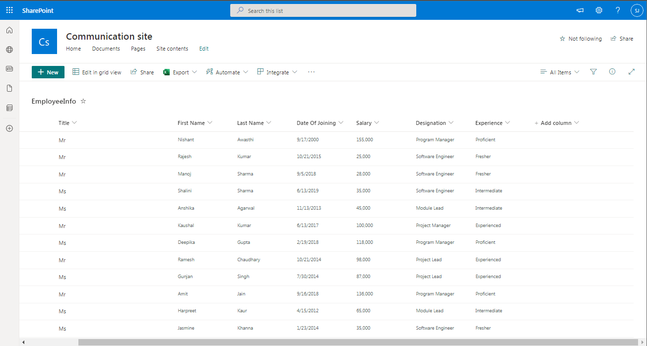
- First create a list "EmployeeInfo" in SharePoint and have some records.
- Now, open the PowerApps maker portal and create a canvas app.
- There will a screen by default "Screen1". Rename it to "ScreenViewByExperience".
- Add the list "EmployeeInfo" as DataSource.
- Now, add a "Blank flexible height gallery" and rename it to ParentGallery.
- Update below properties of "ParentGallery"-
- X: 0
- Y: 100
- Width: ScreenViewByExperience.Width
- Height: ScreenViewByExperience.Height-ParentGallery.Y
- Items: Distinct(EmployeeInfo,Experience.Value)
- Now, click on template edit icon and add a "Label" and another "Blank flexible height gallery".
- For Label, update below properties:
- Name: Label_Experience
- Text: ThisItem.Result
- X: 0
- Y: 0
- Width: Parent.Width
- Height: 40
- Fill: RGBA(0, 13, 75, 1)
- Color: RGBA(255, 255, 255, 1)
- The outcome will be-
- Similarly, update the properties of child gallery as below
- Name: ChildGallery
- X: 0
- Y: Label_Experience.Y+Label_Experience.Height
- Width: Parent.Width
- Height: Parent.TemplateHeight-Label_Experience.Y-Label_Experience.Height
- Items: Filter(EmployeeInfo,ThisItem.Result in Experience.Value)
- TemplateSize: 40
- TemplatePadding: 0
- The outcome will be-
- Now, edit the ChildGallery again and add 2 labels to show "First Name" and "Last Name". Link them with ThisItem.'First Name' and ThisItem.'Last Name'.
- We have the basic structure ready. Now, comes to the actual part.
- Click on App >> OnStart property and add below code.
Set(vrSelectedItemID,0); Set(vrClickCounter,0);
- We have initialized 2 variables-
- vrSelectedItemID- It will capture the ID of the item, user has clicked and will be used to validate the upon next click whether the same item is re-clicked or other item is clicked.
- vrClickCounter- It will capture the count of click for a particular item
- Now, click on ChildGallery >> OnSelect property and write below code
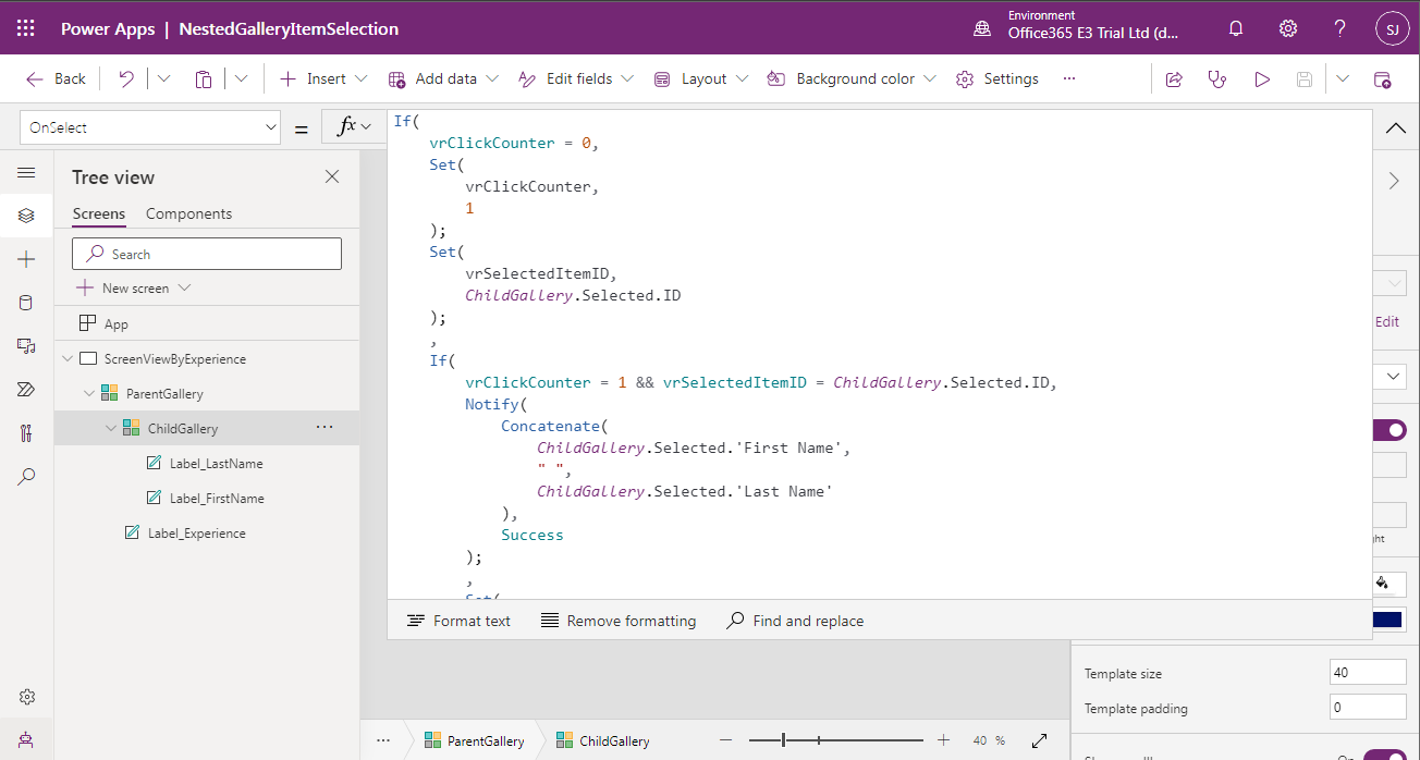
If( vrClickCounter = 0, Set( vrClickCounter, 1 ); Set( vrSelectedItemID, ChildGallery.Selected.ID ); , If( vrClickCounter = 1 && vrSelectedItemID = ChildGallery.Selected.ID, Notify( Concatenate( ChildGallery.Selected.'First Name', " ", ChildGallery.Selected.'Last Name' ), Success ); , Set( vrSelectedItemID, ChildGallery.Selected.ID ); ) )
- The outcome is-
- Next, click on ChildGallery >> TemplateFill property and write below code.
If(vrSelectedItemID = ThisItem.ID,RGBA(244, 196, 48, 1),RGBA(0, 0, 0, 0))
- The outcome is-
- Save the application, publish it and run/play.
- On Load-
- Clicked "Deepika Gupta"
- Clicked "Manoj Sharma"
- Re-Clicked "Manoj Sharma"
- This is how, you can achieve the functionality. If you want to navigate to another screen upon double click, then instead of using Notify, use Navigate function.
- In case, if you wish to give user the "Hand" experience upon hover, then replace the labels used in child gallery with buttons and update the properties as below-
Color RGBA(0, 13, 75, 1) Fill Transparent BorderColor Transparent DisabledColor Self.Color DisabledFill Self.Fill DisabledBorderColor Self.BorderColor PressedColor Self.Color PressedFill Self.Fill PressedBorderColor Self.BorderColor HoverColor Self.Color HoverFill Self.Fill HoverBorderColor Self.BorderColor BorderStyle None BorderThickness 0 OnSelect Select(Parent) BorderRadius 0 - After replacing labels with buttons, below is the outcome-
- As we can see, there is no difference in the outcome. However, when you hover the mouse upon the item, you will find the cursor converted into Hand.
Tuesday, September 27, 2022
PowerApps: Highlight Selected Item In Gallery
Wednesday, October 6, 2021
PowerApps: Convert Delimiter String To Collection Using Ungroup And ForAll
Hello Friends,
Welcome back with another post on PowerApps. Recently, we came up with a scenario where user has selected choice of cities for each state and the same got displayed as comma separated value in gallery.
Now, while saving, we have to split this string and create a collection like below screenshot so that we can save the information in data source.
Initially, things were looking extreme complex and not getting the way to resolve. But Where, there is a lock, there is a key. If there is a question, then there will be an answer.
So, we also figured out the resolution. Let's try-
- First of all create a blank canvas app by logging in PowerApps maker platform.
- Now, add a button (Name: btnLoadCollection; Display Text: Load Collection) to create a collection and assign the below function to OnSelect property.
- The complete code is-
ClearCollect( collMyData, { State: "Uttar Pradesh", Cities: "Lucknow, Kanpur, Meerut" }, { State: "Rajasthan", Cities: "Jodhpur, Jaisalmer, Alwar,Ganganagar" }, { State: "Gujarat", Cities: "Ahmedabad,Gandhi Nagar" } );
- Now, we will add a gallery (Name: ParentGallery) and link this gallery with the collection created above.
- Now we will add another button (Name: btnSplitData), which will split the string, convert into collection then we will use Ungroup function to get the desired result.
- We will add the functions one by one to achieve the functionality. First add below function to OnSelect property.
ClearCollect( TempSplittedCollection, [] ); ForAll( ParentGallery.AllItems, Collect( TempSplittedCollection, { State: State, City: Split( Cities, "," ) } )
);- It will create a collection "TempSplittedCollection" which will be having 2 columns-
- State
- City (it will hold another collection having cities separated based on delimiter)
- Here you will see that the "TempSplittedCollection" is somewhat similar to the result we get after using GroupBy function. It means, if we apply Ungroup, we should get desired result. Therefore, add below code to OnSelect property of btnSplitData just after the previous code.
ClearCollect( FinalSplittedData, Ungroup( TempSplittedCollection, "City" ) );
- The output, we receive upon clicking of this button comes out to be-
- This is the result we were looking for.
- Now, we can apply Patch command with ForAll to save this data to our data source.
- Lastly, we can add a cleaning code for the collections we have created during Split functionality (if required).
- The complete code to be written on OnSelect property of btnSplitData will be-
ClearCollect( TempSplittedCollection, [] ); ForAll( ParentGallery.AllItems, Collect( TempSplittedCollection, { State: State, City: Split( Cities, "," ) } ) ); ClearCollect( FinalSplittedData, Ungroup( TempSplittedCollection, "City" ) );
- If you wish to get this final data to be displayed on screen, add another gallery and bind the Items with "FinalSplittedData" collection.
- This way we can achieve the desired functionality.
Sunday, September 26, 2021
PowerApps: Nested Gallery - Alternate Row Color
Hello Friends,
Welcome back with another post on PowerApps. In our last post, we have studied on how to create nested Gallery and then we have applied the Expand / Collapse feature on that gallery. Then we applied Expand All / Collapse All.
- PowerApps: Nested Gallery
- PowerApps: Nested Gallery - Expand / Collapse
- PowerApps: Nested Gallery - Expand All / Collapse All
- Click on GalleryItemDetails gallery and select the Items property. Right now it is mentioned as ThisItem.ListItemDetails.
- Now, change the function with below-
With( {RecordsListItemDetails: ThisItem.ListItemDetails}, ForAll( Sequence(CountRows(ThisItem.ListItemDetails)), Patch( Last( FirstN( RecordsListItemDetails, Value ) ), {RowNumber: Value} ) ) )
- Further, select the TemplateFill property of the same gallery (GalleryItemDetails) and add below function. It will check if Mod value is ZERO (means even number row) then it will apply one color otherwise (odd number row) other color.
If(Mod(ThisItem.RowNumber,2)=0,RGBA(241, 244, 209, 1),RGBA(200, 200, 200, 1))
- Save the PowerApps and execute/play. The magic works. 🙂
- This way, we can add Alternate Row Color in PowerApps Gallery.
PowerApps: Nested Gallery - Expand All / Collapse All
Hello Friends,
Welcome back with another post on PowerApps. In our last post, we have studied on how to create nested Gallery and then we have applied the Expand / Collapse feature on that gallery.
If you have not read these posts, please go through it.
Now, we will try to implement Expand All / Collapse All feature. Let's start-
- I am assuming that you have read my last 2 posts mentioned above and created the PowerApps as described. We will continue from there.
- Let's add 2 buttons-
- Button1:
- Name: btnCollapseAll
- Text: Collapse All
- OnSelect: ClearCollect(SelectedOrderIDCollection,{SelectedOrderID:0})
- Button2:
- Name: btnExpandAll
- Text: Expand All
- OnSelect:
ClearCollect( SelectedOrderIDCollection, {SelectedOrderID: 0} ); ForAll( OrdersList, If( CountRows( Filter( SelectedOrderIDCollection, SelectedOrderID = OrdersList[@OrderID] ) ) = 0, Collect( SelectedOrderIDCollection, {SelectedOrderID: OrdersList[@OrderID]} ) ) );
- For Collapse All, we have cleared the collection which was storing the OrderID. As the collection becomes clear, no Order is there therefore, all galleries height will become ZERO (0).
- For Expand All, first we have cleared the collection, then, we have added all OrderIDs in that collection. Therefore, all galleries will be now having height based on their items count.
- That's all. It was so simple to implement.
- This way you can apply Expand All & Collapse All feature in nested gallery.
Friday, September 24, 2021
PowerApps: Nested Gallery - Expand / Collapse
Hello Friends,
Welcome back with another post on PowerApps. In our last post, we have studied on how to create nested Gallery. We have successfully achieved the functionality. Now, by default, all nested galleries were appearing in expanded mode. We want to show only the selected order item gallery in expanded mode and other in collapse mode. Let's see-
If you have not read my previous post on Nested Gallery, please visit below link to go through and create the Nested Gallery PowerApps.
Now, as we to make changes so that only the selected Order's detail would get expanded and remaining gets collapsed. For this,
- Option 1: Only One Expanded At A Time
- We will make a little change in the height property of nested gallery. Set the Height property of GalleryItemDetails as
If(ThisItem.OrderID = GalleryOrderMaster.Selected.OrderID,(CountA(ThisItem.ListItemDetails.ItemName)+1)*50,0)
- This way, when we click on any Order ID, it's nested gallery will get a height of 50 times the number of rows +1. For rest of the order ids, their nested gallery will have the height as 0.
- Now save the PowerApps and execute (play). The output will be
- This way, only one order will be displayed in expanded mode at a time.
- Option 2: Multiple Expanded At A Time
- Sometimes there could be scenario that user need to expand more than one order at a time. Click on order id should be in a toggle mode. If Collapsed then it should expand otherwise collapse.
- For this, we will use another local collection, where we will store the OrderID, upon which the user has clicked. Upon first click, the ID will get saved in this collection.
- Upon second click, it will be removed from the collection.
- This would be a repetitive process.
- For this, we will add a collection creation code on btnLoadData. You may write the same on App >> OnStart.
ClearCollect(SelectedOrderIDCollection,{SelectedOrderID:0});
- It will create a local collection with name as "SelectedOrderIDCollection" and having one record with column name as SelectedOrderID and value as 0. Being 0 will not be ID for any order hence, it will not impact our logic.
- Now add below logic on GalleryOrderMaster >> OnSelect property-
If( CountRows( Filter( SelectedOrderIDCollection, SelectedOrderID = GalleryOrderMaster.Selected.OrderID ) ) = 0, Collect( SelectedOrderIDCollection, {SelectedOrderID: GalleryOrderMaster.Selected.OrderID} ), Remove( SelectedOrderIDCollection, Filter( SelectedOrderIDCollection, SelectedOrderID = GalleryOrderMaster.Selected.OrderID ) ) )
- This function will check if the selected OrderID is present in local selected collection (SelectedOrderIDCollection). If not, then this function will add it, otherwise it will remove. Means a toggle functionality will work.
- Now, we redefine the Height property of GalleryItemsDetails. Change the existing function to-
(CountA(ThisItem.ListItemDetails.ItemName) + 1) * 50 * CountA( Filter( SelectedOrderIDCollection, SelectedOrderID = ThisItem.OrderID ) )
- Now save the PowerApps and execute/play the same.
- This way, we can achieve the multiple expand feature in PowerApps nested gallery.
- In our next post, we will learn about Expand All / Collapse All.
PowerApps: Nested Gallery
Hello Friends,
Welcome back with another post on PowerApps. We are starting a series of posts in which we will learn about-
- Nested Gallery
- Expand / Collapse (individual master child record set)
- Expand All / Collapse All
- Alternate row color
We will learn all these features one by one. So let's start-
- Before starting, we need a SharePoint List having below columns-
- OrderID
- ItemName
- ItemQuantity
- We have kept the list simple to just show the functionality.
- Now add 5-6 orders with each having multiple items.
- Now click on App Launcher (grid of 9 dots at top left corner) and click on PowerApps to open the PowerApps maker platform.
- I am creating PowerApps in Tablet mode so that the display of nested gallery should be clear.
- First of all, add connection with SharePoint list. For this, click on Data icon from left navigation menu, click on Add Data. Now select the SharePoint connector. Select the Site and then list "OrdersList".
- Now, add a button at bottom right corner which will load the data from SharePoint to local collection.
- Click on Insert >> Button. Rename it btnLoadData. Set Text as "Load Data".
- Add below function on "OnSelect" property-
ClearCollect(OrdersListCollection,GroupBy(OrdersList,"OrderID","ListItemDetails"));
- This function will load the data from SharePoint list into a local collection "OrdersListCollection" with grouping on OrderID. The grouped data will reflect under column "ListItemDetails". It means, the local collection will have two column-
- OrderID
- ListItemDetails
- Now we will add gallery control on screen. For this, choose the gallery of type "Blank flexible height". The reason behind this is that we will expand the item based on the number of child items.
- Set the-
- Height property of gallery as "Parent.Height"
- Width property as "1000"
- Items property as "OrdersListCollection"
- Now click on the Edit icon of item template as shown in below screenshot-
- Add a label and set it's-
- Width as 400
- Position X as 0
- Position Y as 0
- FontWeight as Bold
- Height as 50
- Fill as RGBA(241, 244, 249, 1)
- Rename it as lblOrderID
- Text as Concatenate("Order ID: ",Text(ThisItem.OrderID))
- Add one more label and set it's-
- Width as 585
- Position X as 400
- Position Y as 0
- FontWeight as Bold
- Height as 50
- Fill as RGBA(241, 244, 249, 1)
- Rename it as lblCustomer
- Text as Concatenate("Customer: ",LookUp(OrdersList,OrderID = ThisItem.OrderID,'Created By'.DisplayName))
- This will show the Order ID and the Customer name. Rename this gallery as "GalleryOrderMaster".
- Now we will add one more gallery, which will show the Items associated with that particular Order ID. Once again, click on edit icon as shown in Step 20 and add another gallery of type "Blank flexible height". Rename it as "GalleryItemsDetails".
- Set-
- Position X as 50
- Position Y as 50 (you may set it dynamic by specifying lblOrderID.Height + lblOrderID.Y)
- Width as 885
- Height as 100 (we will make it dynamic later in code)
- Items as ThisItem.ListItemDetails
- Now we will add two labels to show the ItemName and ItemQuantity.
- Add first label and set-
- Name as lblItemName
- Text as ThisItem.ItemName
- Position X as 0
- Position Y as 0
- Width as 300
- Height as 50
- Similarly, add another label and set-
- Name as lblItemQuantity
- Text as ThisItem.ItemQuantity
- Position X as 300
- Position Y as 0
- Width as 300
- Height as 50
- This way you can show nested items. The basic part is complete. Now, if you execute the PowerApps, you will find that the height of nested gallery is fixed. So, we will make it dynamic. For this, set the Height of GalleryItemDetails as "(CountA(ThisItem.ListItemDetails.ItemName)+1)*50". We have added +1 to make sure there should be no scrollbar.
- This way we can achieve nested gallery functionality. In next post, we will discuss about Expand / collapse feature in nested gallery.
- UPDATE:
- Some times, you may find that if the data in nested gallery is too large, then the behavior of parent-nested gallery becomes abnormal.
- As you can see, Parent Items (Kamal, Manoj...) are inline with Child Items (Item-491, Item-492...). (Below is the dynamic height code which you will read in my next articles of this series).
- The Height code is-
If( ThisItem.OrderID = ParentGallery.Selected.OrderID, (CountA( Filter( CollChild, OrderID = ThisItem.OrderID ).ItemName ) + 1) * 50, 0 )- To avoid this situation, we need to fix the height of child gallery upto a max limit. But the problem is that, there is Max Height property available for Gallery control.
- So, we have prepared a workaround to overcome this problem. We have Min function. We will make use of it.
- Let's modify the code for Height (I am taking maximum height for child gallery as 400)-
If( ThisItem.OrderID = ParentGallery.Selected.OrderID, Min( (CountA( Filter( CollChild, OrderID = ThisItem.OrderID ).ItemName ) + 1) * 50, 400 ), 0 )- After implementing this code, the height of child gallery is set to maximum 400 as the calculated height was much greater than 400. Therefore, Min function gave 400 as output.
- In case if the calculated height is less than 400, in that case, the Min function will gave the calculated value as output.