Monday, February 20, 2023

PowerApps: Scroll Bar In Gallery

Hello Friends,
Welcome back with another post on PowerApps. Sometimes, we came across with a situation where we have to display a large number of columns in gallery (usually - vertical gallery or flexible height gallery) and doing so, the gallery width goes beyond the screen width. Unfortunately, the gallery doesn't have any horizontal scroll. So, how to overcome this situation?
Today, we are going to create something which will resolve this issue.


Let's start.
  1. Before starting, we need a collection to be used as datasource. If you have a datasource then it's fine. For demo purpose, I am creating a collection as per below schema.
    1. ClearCollect(
          collSampleData,
          {
              ID: "1",
              EmployeeID: "ES-1001",
              FirstName: "Tonya ",
              LastName: " Guzma",
              Father: "Anthony Shea",
              Mother: "Rhonda Schultz",
              Child1: "Jimmy Moore",
              Child2: "Jessica Cruz",
              Key1: "CED6E09DF06F4C1CB269662F2BE2954D",
              Key2: "CEB2CC72451C454F96077DD931308910",
              Key3: "8F03AA3F37694C978F3719B3E36C2EB9"
          } )
  2. Added around 160 records thereafter in this collection.
  3. Login to PowerApps Maker Portal and create a Canvas App.
  4. Rename the sceen as "ScreenHome".
  5. Choose the App >> OnStart property and create a collection as stated above.
  6. Then click on ellipses of App and choose "Run OnStart".
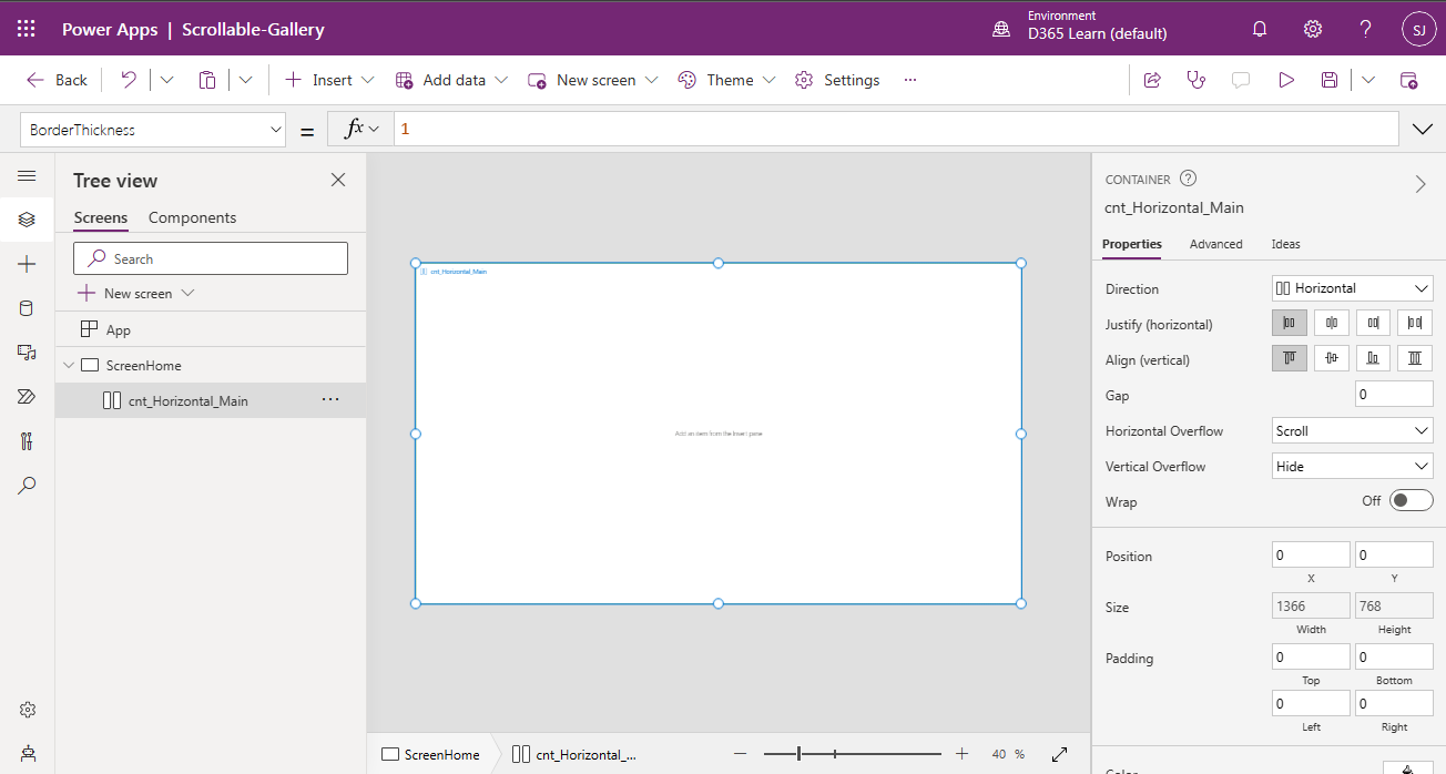
  7. Now add "Horizontal container" on screen. Wherever in doubt, match the control icon and set the properties as-
    1. Name: cnt_Horizontal_Main
    2. LayoutOverflowX (Horizontal Overflow): LayoutOverflow.Scroll
    3. X: 0
    4. Y: 0
    5. Width: ScreenHome.Width
    6. Height: ScreenHome.Height
    7. BorderColor: ColorValue("#007F00")
    8. BorderStyle: BorderStyle.Solid
    9. BorderThickness: 1
  8. Inside this container, add plain "Container" and set it's properties as-
    1. Name: cnt_Plain_Inner
    2. AlignInContainer: AlignInContainer.SetByContainer
    3. FillPortions (Flexible Width): 0
    4. Width: (Set Later Using Gallery Width)
    5. Height: Parent.Height-20 (20 is subtracted to view the horizontal scroll of parent container)
  9. Now add label controls to create headers of gallery.
  10. Add "Text label" and set properties as below-
    1. Name: lbl_Header_ID
    2. Text: ID
    3. Size: 15
    4. FontWeight: FontWeight.Semibold
    5. Align: Align.Center
    6. X: 0
    7. Y: 0
    8. Width: 150
    9. Height: 40
    10. Color: RGBA(255, 255, 255, 1)
    11. Fill: RGBA(0, 18, 107, 1)
  11. Add another "Text label" and set properties as below-
    1. Name: lbl_Header_EmployeeID
    2. Text: Employee ID
    3. Size: 15
    4. FontWeight: FontWeight.Semibold
    5. Align: Align.Center
    6. X: lbl_Header_ID.X+lbl_Header_ID.Width
    7. Y: lbl_Header_ID.Y
    8. Width: 150
    9. Height: 40
    10. Color: RGBA(255, 255, 255, 1)
    11. Fill: RGBA(0, 18, 107, 1)
  12. The layout comes out to be-
  13. Now, add "Text label" for rest of the headers and set properties as mentioned above (similar to lbl_Header_EmployeeID). Remember to change the X property value based upon previous control each time. The naming convention, I am using here for rest of the headers as-
    1. Name: lbl_Header_FirstName
      1. Text: First Name
    2. Name: lbl_Header_LastName
      1. Text: Last Name
    3. Name: lbl_Header_Father
      1. Text: Father Name
    4. Name: lbl_Header_Mother
      1. Text: Mother Name
    5. Name: lbl_Header_Child1
      1. Text: Child 1
    6. Name: lbl_Header_Child2
      1. Text: Child 2
    7. Name: lbl_Header_Key1
      1. Text: Key 1
    8. Name: lbl_Header_Key2
      1. Text: Key 2
    9. Name: lbl_Header_Key3
      1. Text: Key 3
  14. The outcome will be-
  15. Now, the next step is to add a Gallery. Therefore, click on Insert and choose Blank flexible height gallery.
  16. Set the properties of gallery as-
    1. Name: gal_BFHG_UserDetails
    2. Items (Data source): collSampleData
    3. X: lbl_Header_ID.X
    4. Y: lbl_Header_ID.Y+lbl_Header_ID.Height
    5. Width: lbl_Header_Key3.X+lbl_Header_Key3.Width
    6. Height: Parent.Height-Self.Y
    7. TemplateSize: 40
    8. TemplatePadding: 5
  17. Now edit the template and add labels to display the data (items). The process will be same as we did for Headers.
  18. Click on edit template icon (pen with circle) in gallery and the click on Insert and choose Text label. Set properties as below
    1. Name: lbl_Item_ID
    2. Text: ThisItem.ID
    3. LineHeight: 1
    4. X: lbl_Header_ID.X
    5. Y: 0
    6. Width: lbl_Header_ID.Width
    7. Height: Parent.TemplateHeight
  19. Add another Text label and set properties as below-
    1. Name: lbl_Item_EmployeeID
    2. Text: ThisItem.EmployeeID
    3. LineHeight: 1
    4. X: lbl_Header_EmployeeID.X
    5. Y: lbl_Item_ID.Y
    6. Width: lbl_Header_EmployeeID.Width
    7. Height: Parent.TemplateHeight
  20. Similarly add rest of the labels.
    1. Name: lbl_Item_FirstName
      1. Text: ThisItem.FirstName
      2. X: lbl_Header_FirstName.X
      3. Width: lbl_Header_FirstName.Width
    2. Name: lbl_Item_LastName
      1. Text: ThisItem.LastName
      2. X: lbl_Header_LastName.X
      3. Width: lbl_Header_LastName.Width
    3. Name: lbl_Item_Father
      1. Text: ThisItem.Father
      2. X: lbl_Header_Father.X
      3. Width: lbl_Header_Father.Width
    4. Name: lbl_Item_Mother
      1. Text: ThisItem.Mother
      2. X: lbl_Header_Mother.X
      3. Width: lbl_Header_Mother.Width
    5. Name: lbl_Item_Child1
      1. Text: ThisItem.Child1
      2. X: lbl_Header_Child1.X
      3. Width: lbl_Header_Child1.Width
    6. Name: lbl_Item_Child2
      1. Text: ThisItem.Child2
      2. X: lbl_Header_Child2.X
      3. Width: lbl_Header_Child2.Width
    7. Name: lbl_Item_Key1
      1. Text: ThisItem.Key1
      2. X: lbl_Header_Key1.X
      3. Width: lbl_Header_Key1.Width
    8. Name: lbl_Item_Key2
      1. Text: ThisItem.Key2
      2. X: lbl_Header_Key2.X
      3. Width: lbl_Header_Key2.Width
    9. Name: lbl_Item_Key3
      1. Text: ThisItem.Key3
      2. X: lbl_Header_Key3.X
      3. Width: lbl_Header_Key3.Width
  21. Now, we will set the width of parent container of gallery; i.e. cnt_Plain_Inner. This will be set to the width of gallery. This is the main point of this post. This setting will provide you the horizontal scroll feature. For this, click on "cnt_Plain_Inner" and then click on Width property and set the width as-
    1. Width: gal_BFHG_UserDetails.Width
  22. All set now. Save the app and play. If you wish to increase the width of any gallery item, you can set it accordingly. For example, I found that Key1, Key2, Key3 columns need to have more width. So, I am increasing width for these 3 columns. To increase the width of column, you have to increase the width of header labels as the gallery columns are referring the width of their respective headers.
  23. Save the app and play.
  24. As you can see, we can scroll the gallery horizontally. The gallery itself is having it's vertical scroll. So, this is how, we can apply Horizontal scroll as well as Vertical scroll.
With this, I am concluding this post.
Happy Coding !!!
Will see you again with some new topics.

Stay Safe !
Stay Healthy !

Tuesday, February 14, 2023

PowerApps: Re-order Items In Gallery

Hello Friends,
Welcome back with another post on PowerApps. Today, we will learn about re-ordering feature in gallery. Surprised, as there is no such built-in feature in gallery. right, therefore, we will build the logic here.
We will apply re-ordering in 2 ways-
  1. Swap the position with Previous / Next item. Example: Swap 2nd position item with 3rd position item or vice-versa.
  2. Position the item at a particular number. Example: Bring the 10th position item to 2nd position.
Let's start.
  1. Open the PowerApps maker portal and create a new app and give a suitable name.
  2. Now click on App and choose the OnStart property and add logic for creating a collection.
    1. ClearCollect(collSampleData,
      {SeqNo:1,Title:"Mr",FirstName:"Aaron",LastName:"Finch"},
      {SeqNo:2,Title:"Mr",FirstName:"Sanjiv",LastName:"Verma"},
      {SeqNo:3,Title:"Mr",FirstName:"Robert",LastName:"Rosch"},
      {SeqNo:4,Title:"Ms",FirstName:"Aakriti",LastName:"Singh"},
      {SeqNo:5,Title:"Ms",FirstName:"Reshma",LastName:"Sharma"},
      {SeqNo:6,Title:"Mr",FirstName:"Kundan",LastName:"Gupta"},
      {SeqNo:7,Title:"Ms",FirstName:"Rajni",LastName:"Chugh"},
      {SeqNo:8,Title:"Ms",FirstName:"Ketty",LastName:"Woods"},
      {SeqNo:9,Title:"Mr",FirstName:"Bob",LastName:"Hamilton"},
      {SeqNo:10,Title:"Ms",FirstName:"Mary",LastName:"Christina"}
      );
  3. Now click on elipses (...) of App and select Run OnStart. It will initialize the collection.
  4. Now click on Insert and search for blank flexible height gallery.
  5. Select this control to add on screen. It will ask you the Data source. Select the collection collSampleData we have created above.
  6. Now resize the app to cover the entire screen or resize as per your application requirements. (optional).
  7. Rename the ggallery as Gallery_ReOrder.
  8. Choose the TemplateSize property and set it's value as 50. Then set the TemplatePadding to 0.
  9. It's time to add controls in this template. Click on Edit Template icon.
  10. Start adding control and set properties-
  11. Icon - Arrow up
    1. Name: IconUp
    2. X: 0
    3. Y: 0
    4. Width: 20
    5. Height: Parent.TemplateHeight
    6. Padding: Top / Bottom / Left / Right: 0
    7. Visible: ThisItem.SeqNo <> First(Sort(collSampleData,SeqNo,Ascending)).SeqNo
    8. OnSelect: 
      1. Select(Parent);
        Set(vrCurrentSeq,Value(ThisItem.SeqNo));
        Patch(collSampleData,ThisItem,{SeqNo:0});
        Patch(collSampleData,First(Filter(collSampleData,SeqNo=vrCurrentSeq-1)),{SeqNo:vrCurrentSeq});
        Patch(collSampleData,First(Filter(collSampleData,SeqNo=0)),{SeqNo:vrCurrentSeq-1});
    9. The concept used here is capture the current item sequence. The get the previous item and set it's seq equal to current one. Then set the current selected item sequence to 1 less than that of current sequence.
  12. Icon - Arrow down
    1. Name: IconDown
    2. X: IconUp.X+IconUp.Width
    3. Y: IconUp.Y
    4. Width: IconUp.Width
    5. Height: IconUp.Height
    6. Padding: Top / Bottom / Left / Right: 0
    7. Visible: ThisItem.SeqNo <> First(Sort(collSampleData,SeqNo,Descending)).SeqNo
    8. OnSelect: 
      1. Select(Parent);
        Set(vrCurrentSeq,Value(ThisItem.SeqNo));
        Patch(collSampleData,ThisItem,{SeqNo:0});
        Patch(collSampleData,First(Filter(collSampleData,SeqNo=vrCurrentSeq+1)),{SeqNo:vrCurrentSeq});
        Patch(collSampleData,First(Filter(collSampleData,SeqNo=0)),{SeqNo:vrCurrentSeq+1});
    9. The concept used here is capture the current item sequence. The get the next item and set it's seq equal to current one. Then set the current selected item sequence to 1 plus than that of current sequence.
  13. Text label
    1. Name: LblSeqNo
    2. X: IconDown.X+IconDown.Width
    3. Y: IconDown.Y
    4. Width: 50
    5. Height: IconDown.Height
    6. Text: ThisItem.SeqNo
    7. Align: Align.Right
  14. Text label
    1. Name: LblTitle
    2. X: LblSeqNo.X+LblSeqNo.Width
    3. Y: LblSeqNo.Y
    4. Width: 70
    5. Height: LblSeqNo.Height
    6. Text: ThisItem.Title
  15. Text label
    1. Name: LblFirstName
    2. X: LblTitle.X+LblTitle.Width
    3. Y: LblTitle.Y
    4. Width: 150
    5. Height: LblTitle.Height
    6. Text: ThisItem.FirstName
  16. Text label
    1. Name: LblLastName
    2. X: LblFirstName.X+LblFirstName.Width
    3. Y: LblFirstName.Y
    4. Width: 150
    5. Height: ILblFirstName.Height
    6. Text: ThisItem.LastName
  17. Drop down
    1. Name: ddSortOrder
    2. X: LblLastName.X+LblLastName.Width
    3. Y: LblLastName.Y
    4. Width: 150
    5. Height: LblLastName.Height
    6. Default: ThisItem.SeqNo
  18. For Items property, first we will add below code in App >> OnStart (after the collSampleData collection creation)
    1. Set(vrCurrentSeq,First(Sort(collSampleData,SeqNo,Ascending)).SeqNo);
      ClearCollect(collSequence,Sequence(CountRows(collSampleData),vrCurrentSeq));
    2. Now click on elipses (...) of App and select Run OnStart. It will initialize the collection collSequence. 
  19. Now set the Items property of ddSortOrder as collSequence.
  20. Save the app.
  21. The remaining part is to write the login for OnChange property of ddSortOrder. It iis little bit complex. Here we need to check if the new position of item is greater than the current position or less. Based upon that, we need to reposition the items. For example, see the below screenshot.
  22. If we are changing order from 4 to 8 then Yellow highlighted items order also need to be updated. Similarly, if we are changing order from 4 to 2, then Yellow highlighted items order also need to be updated.
  23. Let's write the logic for ddSortOrder >> OnChange property.
    1. Select(Parent);
      Set(vrCurrentSeq,Value(ThisItem.SeqNo));
      Set(vrDesiredSeq,Value(ddSortOrder.Selected.Value));
      Patch(collSampleData,ThisItem,{SeqNo:0});
      If(vrDesiredSeq>vrCurrentSeq,
          ClearCollect(collNewSequence,Sequence(vrDesiredSeq-vrCurrentSeq,vrCurrentSeq+1));
          ForAll(collNewSequence,Patch(collSampleData,First(Filter(collSampleData,SeqNo=Value)),{SeqNo:Value-1}));,
          ClearCollect(collNewSequence,Sequence(vrCurrentSeq-vrDesiredSeq,vrDesiredSeq));
          ForAll(collNewSequence,Patch(collSampleData,First(Filter(collSampleData,SeqNo=Value)),{SeqNo:Value+1})););
      Patch(collSampleData,First(Filter(collSampleData,SeqNo=0)),{SeqNo:vrDesiredSeq});
  24. Last, to give a beautiful appearance to the grid, we will fill a background color to the alternate rows. For this, update the TemplateFill property of GalleryReOrder as below.
    1. If(Mod(ThisItem.SeqNo,2)=0,RGBA(222,222,222,1),RGBA(0,0,0,0))
  25. Save the app, publish and Run/Play.
  26. If you play this app and try to change the order, you will find that the order gets changed but the grid is not showing data properly. The reason is that, we had not applied the Sorting on grid datasource.. Edit the app and choose the gallery GalleryReOrder >> Items property. Here you will find that the datasource collSampleData is directly associated. Change it to -
    1. Sort(collSampleData,Value(SeqNo),Ascending)
  27. Now, save/publish and Run/Play.
  28. I swapped order 3 to 2 by clicking Up icon and the results are-
    1. Before
    2. After
  29. Now, I am swapping order 9 to 10 by clicking Down icon and the results are-
    1. Before
    2. After
  30. Now, I will reorder the item of position 7 to position 3 using drop down and the results are-
    1. Before
    2. After

With this, I am concluding this post.
Happy Coding !!!
Will see you again with some new topics.

Stay Safe !
Stay Healthy !